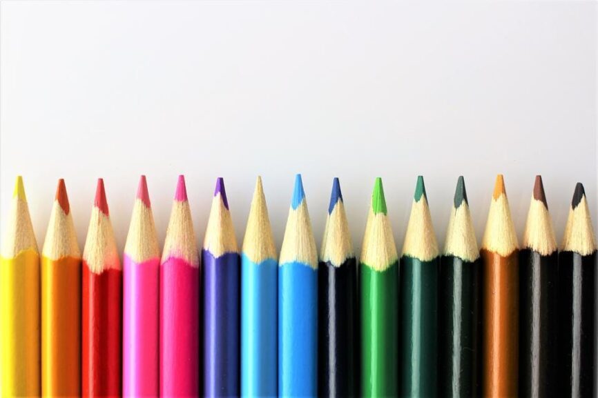
Brand Color Selection
Brand color selection requires deep analysis and color theory has a special complexity and elegance. The psychology of colors in branding is one of the most interesting aspects of marketing. Deciding how to use colors to convey a message in marketing and branding is an effective action and should be done carefully.
Color Psychology and Brand Color Selection Method
Color psychology is the study of how color affects perception and behavior. In business branding and marketing, color psychology encourages consumers to buy from specific brands. It is interesting to know that researchers found that 90% of audience judgments about a product can be based on its color. Research has shown that people’s personal experiences, upbringing, differences, cultural roots and the influence of individual colors are completely different for each person.
The same color may affect two people differently. Research has shown that predicting the consumer’s reaction to the fit of color with the product is more important than the color itself individually. Therefore, before choosing the type of color, we should ask ourselves whether the color we choose is compatible with the product or service we provide and meets the customer’s expectations.
The Effect of Colors in Branding

1. Blue Color
This color is more popular with men. It curbs appetite and shows relaxation. Blue color increases productivity and is mostly used in office spaces. Blue color creates a sense of security and trust in the brand and is very effective in banks and financial institutions. If our store is blue, people will trust it 15% more.
2. Orange Color
Orange color represents passion and excitement and shows warmth. This color is a sign of caution. Brands with orange color convey to the audience the value of high purchase compared to cheaper purchase, therefore they are effective in economic stores.
3. Purple Color
It is the color of royalty, success, wealth and wisdom. In marketing it is used for relief and relaxation. This color is mostly used in cosmetics and anti-aging products. Purple represents imaginative and creative brands. This color is a perfect blend between the stability of blue and the energy and power of red, making it the most common color in luxury brand items.
4. Black Color
This color shows complexity, mystery and power. Black color is used to sell shiny and luxury items, and it is widely used in the cosmetics industry, especially lipstick.
5. White Color
White is the color of cleanliness, purity and safety and is used for neutrality. This is the most common color for marketing while discounting prices. Some big global brands like Google use white color to create contrast on their homepage. This color is used in office blocks.
6. Green Color
Green always means peace and is effective in branding environmental issues or anything related to this field. Sometimes this color is related to financial spaces and commercial brands and in this context, it is used as mint green color. Tech companies prefer to use green color because it is refreshing and brings life and peace.
7. Brown Color
Brown color is used to create warm and attractive feeling or appetizing. This color is often used in commercial advertisements for chocolate and similar foods.
8. Pink Color
Pink can be a suitable color for cosmetics and it is also used in some medical brands.Pink is a favorite color of women and children and is widely used in their related products.
9. Red Color
The red color contains strong emotions, increases appetite and symbolizes passion and love. This color increases the heart rate and is acceptable to stimulate the purchase of a color. This color also stimulates the appetite glands, and for this reason, it is used in most restaurants, especially fast foods.
10. Yellow Color
This color stimulates the mental process, strengthens communication and increases vitality. Yellow color in marketing represents optimism, youth and transparency. It is interesting to know that yellow is the first color that babies react to, and that is why it is used in most children’s products and toys.
This color has one of the longest wavelengths, making it one of the most attractive colors in psychology. Of course, due to the irritation it has for the eyes, it is usually combined with other colors.
Many retailers prefer orange or green as their brand color. Because it can draw optimism and stability. Most food logos include some shade of red because they believe that this color can increase people’s appetite.
Choose Brand Color and Gender
It is interesting to know that gender plays a role in influencing the choice of brand color. Men usually prefer bright and intense colors, but women like soft colors. Also, men welcome the addition of dark colors such as black to a color combination, while women welcome lighter colors.
Differentiation from Similar Brands
Remember that consumers like to be indicators. If a brand similar to ours chooses blue as its commercial color, we go for something like purple. Repeating the same blue can never be the foundation of our brand’s success.

Up To Sum
By understanding the identity of a commercial brand, its appropriate colors are used in branding. However, in parallel with this issue, the understanding of the target society of each brand towards different colors should be considered. This is a complex issue that must be expediter and cannot be viewed from one perspective.


